
Visual design: you know when it’s good; you know when it’s bad. But as the person tasked with knocking out a gorgeous site for your business, how do you arrive at great visuals for your website? In this article, you’ll learn what to consider when selecting a visual design, some elements of style, and how the gurus at Swarm Digital can create a stylish site custom-fitted to your business, brand, customers, personality, and market.
Here’s what we’ve learned working with clients for over a decade: if you’re looking for a new website, then often you probably know how it should look already. Maybe you can’t put it into words. Perhaps all you know is that you need something different from what you’ve got. At Swarm, we’re listening–it’s our job to draw that out and turn your vision into a site. Let’s look at the questions we’ll ask to determine the look you need.
Know Your Purpose
In web design, in business, in everything–you need to start, as Simon Sinek says, with ‘the why.’ What is the purpose of your website?
On our Website Design Guidance Form, we help you break that down.
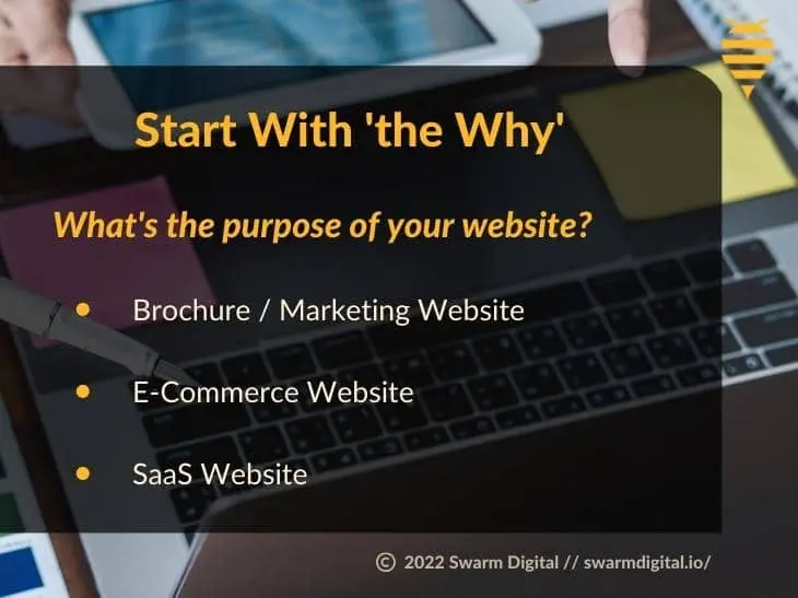
A site is where customers find you, do business with you, and have their needs met. We’ll ask you to choose between three types:
Brochure / Marketing Website
A large portion of business websites fall into this category. Its purpose is to get customers or clients to your door. It’ll attract them, describe your product or service invitingly and succinctly, and provide easy methods to put them in touch with you. There’s an important distinction between this type and the one below: it doesn’t process payments online.
E-Commerce Website
An e-commerce site has the ability to both take orders and process payments online. Amazon is the biggest e-commerce platform on Earth, but it doesn’t corner the market by any means. If you run a restaurant and customers can order online, you’ve essentially got an e-commerce site.
SaaS Website
One buzzword you might have stumbled across in your online research is SaaS or “Software as a Service.” That’s geek-speak for an online app that does things. Disney Plus, for example, is SaaS: it’s a web-based service that plays videos. So is Dropbox: it’s a big hard drive in the sky. Google Docs is SaaS as well: it’s a bunch of applications that ape Microsoft Office through a browser. If your desired website does stuff like that, then check the third option on our Web Design Guidance Form: Web Application/SaaS Website.
Let’s get deeper and look at a few more identity considerations. None of them sound ‘visual,’ but they lay the foundation for the visual design process.
Your Business
If you’re a gym, we know you need a site that’ll invite people to change their lives through fitness. If you sell high-end bedding, your site needs to show what makes your product unique. If you’re a construction company, you want to display quality, competence, and credibility. Either way, you want a look that will engage your ideal customer.
Your Brand
“Branding” means more than a cool logo (though that helps, and we can do that). It’s an expression of your brand’s personality. For example, when you think about Mountain Dew, you think of a sugary drink for overstimulated gamers. How about Apple? Design-y-looking gadgets, clean lines, Swiss fonts, black turtlenecks. Speaking of Swiss, close your eyes and say the word, “Rolex.” What do you see? Whoopity-doo luxury.
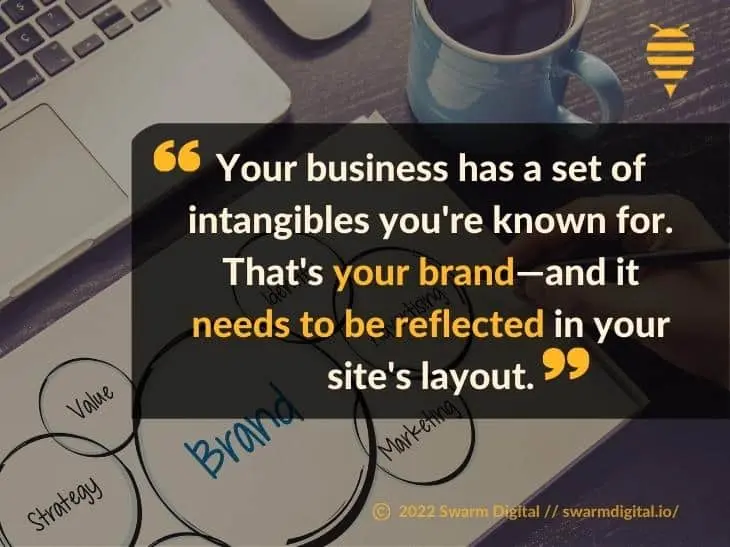
Whether you’ve got billboards and celebrity spokesmen or just a box of business cards and your character, your business has a set of intangibles you’re known for. That’s your brand—and it needs to be reflected in your site’s layout.
Your Customers
Your site should visually attract two kinds of customers: the ones you’ve got and the ones you want. Who are they? How do they dress? What websites do they visit? What shows do they watch on television? You obsess over these questions already; let us build a website with a visual style that attracts them.
Your Market
You compete with other businesses that have competing sites. What are they doing? How does their web presence look? What do their customers expect from them? What should your customers expect from you? What does that look like online?
Now What?
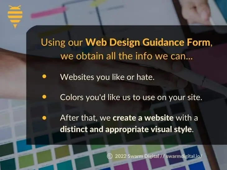
Using our Web Design Guidance Form, we obtain all the info we can about those key factors. We ask you for websites you like or hate. We ask what colors you’d like us to use on your site. We’re committed to understanding what you need from your site.
Once that’s done, you’ve passed us the ball. After that, we create a website with a distinct and appropriate visual style.
Know Your Style
Is there a lot to visual design? Yes. But that doesn’t mean we can’t look behind the curtain and learn, from a bird’s-eye view, how Swarm understands your business and then expresses it visually. Here, we’ll briefly look at how simplicity, color, and flow impact your site’s design.
Complexity
Click on this link. We dare you:
It’s Google: the number-one search engine globally and our All-Powerful Internet Overlords. But they’re not messing around with their visuals. Their homepage is the most significant example of simplicity in web design.
How? Okay, you’ve looked at the web’s first-place search engine. Now take a look at the site in third place:
Do you get it? The difference is easy to spot: Google’s home page has two big buttons to click on, while Yahoo’s has fourteen-and-a-half-thousand.
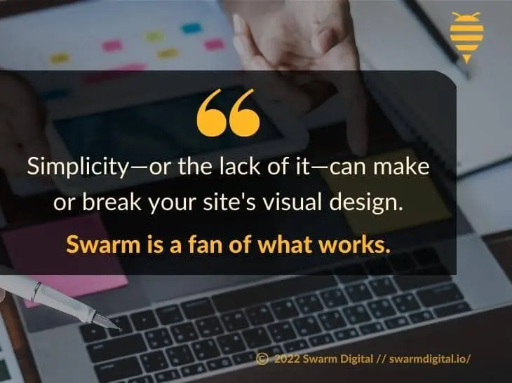
What’s the lesson? Simplicity–or the lack of it–can make or break your site’s visual design. Swarm is a fan of what works. Sometimes that’s simplicity—and sometimes it’s not. We’ll help you find the perfect balance.
Color
What colors should you use on your website? Which are the most attractive?
Your business might be best-reflected through a clear, organized, simple color scheme like the one used in this exceptional example (just to be clear, we didn’t design this site):
Or, if you like to party, a sensory-overload approach to color sometimes has its merits (we didn’t design this one, either, but it’s a phenomenal case-in-point):
Between those two extremes, you can see the benefit of a thoughtful approach to color on your site. This is something we obsess over at Swarm. Our Website Design Guidance Form asks which colors to use–but if you’re not sure, we’re here to help.
Flow
“Flow” here is not a yoga term. When a website has good flow, the viewer’s eye will flow across a webpage in a guided manner. Ideally, when users see your site, they’ll quickly understand your product or service, get excited about its benefits, and reach out to you.
If you’re looking for a prime example of flow, check out Netflix’s landing page:
You almost type your email into the box without knowing why. That’s flow.
Quip’s homepage flows beautifully, breaking down several products in a way that’s clear and comprehensible (check out the colors, too–fantastic):
Conclusion
When you choose a web designer, you’re often entrusting your brand to strangers. Here at Swarm Digital, we know what it’s like–but we bring decades of combined experience to the table to ensure your business, brand, customers, personality, and market are covered. We take our job seriously, leveraging every visual design element–simplicity, color, flow, and more–to maximize your presence online.
Give us a call now and receive a free consultation. What can we do to put your vision before your eyes? Click here to consult or call us directly at +1(855) 244-4407.

Matthew Weitzman co-founded Swarm Digital to build the agency he wished existed — technical enough to actually fix what's broken, and honest enough to tell you the truth about it. He leads the engineering and SEO side of the business, from web-application architecture to the technical SEO that decides whether Google can even read a site. His approach is code-first: he'd rather solve a ranking problem at the source than paper over it with a plugin. He writes about SEO, web development, Core Web Vitals, and where AI is taking search.
See more articles by Matthew →